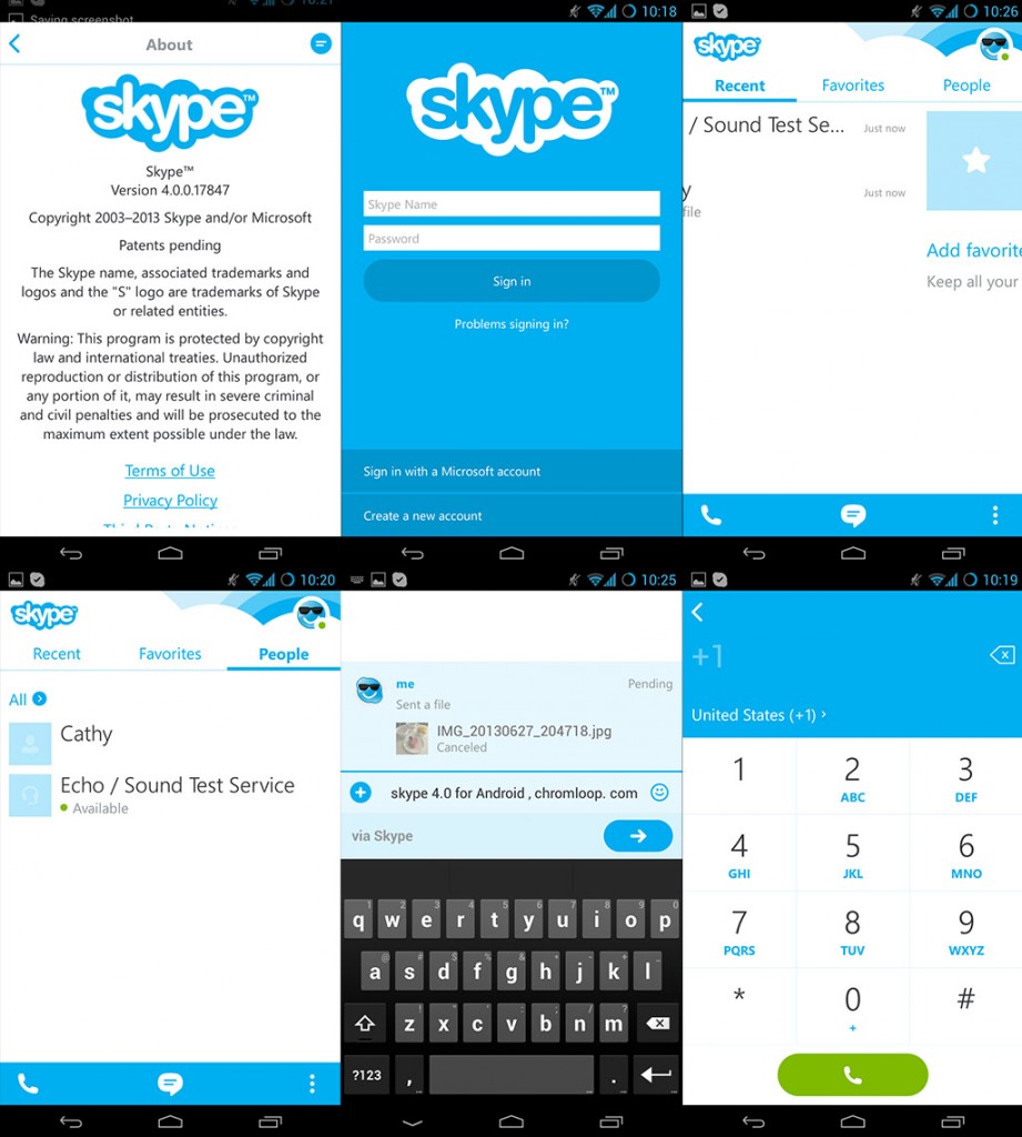
So Microsoft just released the new Skype 4.0 for Android with brand new user interface, here comes the Skype 4.0 for Android Review. The main purpose of using new UI design is to make Skype has an uniform style on all mobile platforms, which is the Windows Phone 8 style(the Metro style). Message from Microsoft on Google Play is, the Skype 4.0 has all the features as Windows phone version, more stable, faster and easier to use, as it is specifically made for Android platforms. They also said that Skype 4.0 for Android is suitable for Android tablets with the new UI design.
Let’s see what is new and improved in Skype 4.0 for Android, How it make things simple and easy to use.
1. The first sight when you login in Skype is the Recent IM(Instant messaging) records. you can switch between Recent, Favorites and People by sweep horizontally, kind of Android style.
2. Microsoft said the new Skype focus on user experience of people communicate by IM, that is true, in Skype 4.0, to send a message to someone, just tap on the message button in the bottom, then choose the people, feels like using the SMS app.
3. A “Send” button was added below the message input box to reduce opportunity of sending message by mistake.
4. Files and video messages can be viewed when you are sending it to someone, also when you try to cancel sending process, Skype will ask you to confirm.
The IM(Instant messaging) interface improved is a good thing, Microsoft is making it looks like the Android Message app, for example, it shows people profile pictures, and these changes making Skype easy to get start for new users.
About how to exit Skype 4.0 for Android? In case you can’t find the way to exit Skype.
The only thing confused me is, when you want to exit Skype 4.0, you need to tap on your profile picture, then tap the menu button and select “sign out”. In previous 3.x version, just tap on the exit button on the top.
Download Skype 4.0 for Android on Google Play store: https://play.google.com/store/apps/details?id=com.skype.raider


![[APK] Camera NX 7.4 is Here, Base on Google Camera 5.2, All Features & Bring back HDR+ for Nexus2015](../../../wp-content/uploads/2016/12/Camera-NX-Google-Camera-MOD-260x150.jpg)
![[APK] Enable Portrait mode on Nexus 5X/6P & OG Pixel phone with Google Camera mod (Updated 7.3.1)](../../../wp-content/uploads/2017/12/Portrait-mode-on-Nexus-5X-with-Camera-NX-mod-260x150.png)
![[Updated] Camera NX V7.2 for Nexus 5X/6P & Pixel Base on Google Camera 5.1 from Pixel 2, Motion Photo and More](../../../wp-content/uploads/2017/10/Camera-NX-v7-260x150.jpg)